Point Defiance Zoo & Aquarium
Interactive Kiosk Design

Project Overview
This project aims to develop an engaging, educational, and user-friendly interactive kiosk for the Red Wolf Woods exhibit at Point Defiance Zoo & Aquarium. The kiosk will enhance the visitor experience by sharing the history and habitat of red wolves, ongoing conservation efforts, and their current status in the wild.
The Problems
Fragmented Information in Exhibit
-
Current exhibits scatter information across indoor/outdoor signage and staff interactions, making it difficult for visitors to piece together a cohesive understanding.
Low Engagement with Static Content
-
Passive displays fail to hold visitors’ attention, reducing interest and retention of exhibit material.
.jpg)
.jpg)

.jpg)
Project Goals
01
Develop an accessible, interactive kiosk that unifies fragmented exhibit information into a seamless, user-friendly experience.
02
Use dynamic content to boost engagement and ensure visitors retain key facts about red wolves beyond their zoo visit.
Design Process
Research
Analysis
Sketch
Wireframe
Prototye
Design & Iteration
User Flow

Visual Direction
The visual design builds on elements from the existing exhibition for continuity, featuring a warm orange-red color scheme inspired by the red wolf and typography matching the website for clear readability.

Sketches

Exploring page layouts with teams
Wireframes
Lo-fi wireframe

Hi-fi wireframe

User Testing
Initial testing at scale to see what’s working and what isn’t.
Screen Testing

User Test


Round 1


Round 2
Some feedback from the user test:
"I like the subpage design but the navigation bar seems too low ."
Tester 1
"The QR code is too large and hard to scan."
Tester 2
"I like the development diagram but the text feels tight."
"On the release page, the year goes back and forth, which is confusing."
Tester 3
"The idea of the mini game is great, but the bug has to be fixed"
"It’d be helpful to have a back button on the last page.""
Tester 4
Refinements

Lo-fi wireframe iterations based
on feedback


Describe your image

Describe your image


Describe your image
Key Revision Areas in Hi-fi wireframe
-
Element positioning adjustments
-
Refined layout and visual aesthetics
-
Adjust visual presentation
-
Refined Text Structure
Final Deliverables
Mockup

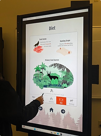
Kiosk preview at Red Wolf Conservation Center
Prototype
Reflections
Takeaways
-
Determine ideal font and image sizes for large kiosk screens
-
Consider the standing distance at the kiosk
-
Communicate with teammates to maintain a consistent visual style across the product
Next Steps
-
Invite potential users from different age groups to test the kiosk in the zoo
-
Fine-tune the content based on the feedback
-
Work with the developer and marketing teams for the kiosk launch